Nordstrom • 2023
Stores & Services
↑ 1.6% conversion↑ 24k new alteration users (1 mo after launch)↑ $1.4M EBIT profitability over the year
Walmart – Generative AI Comparison
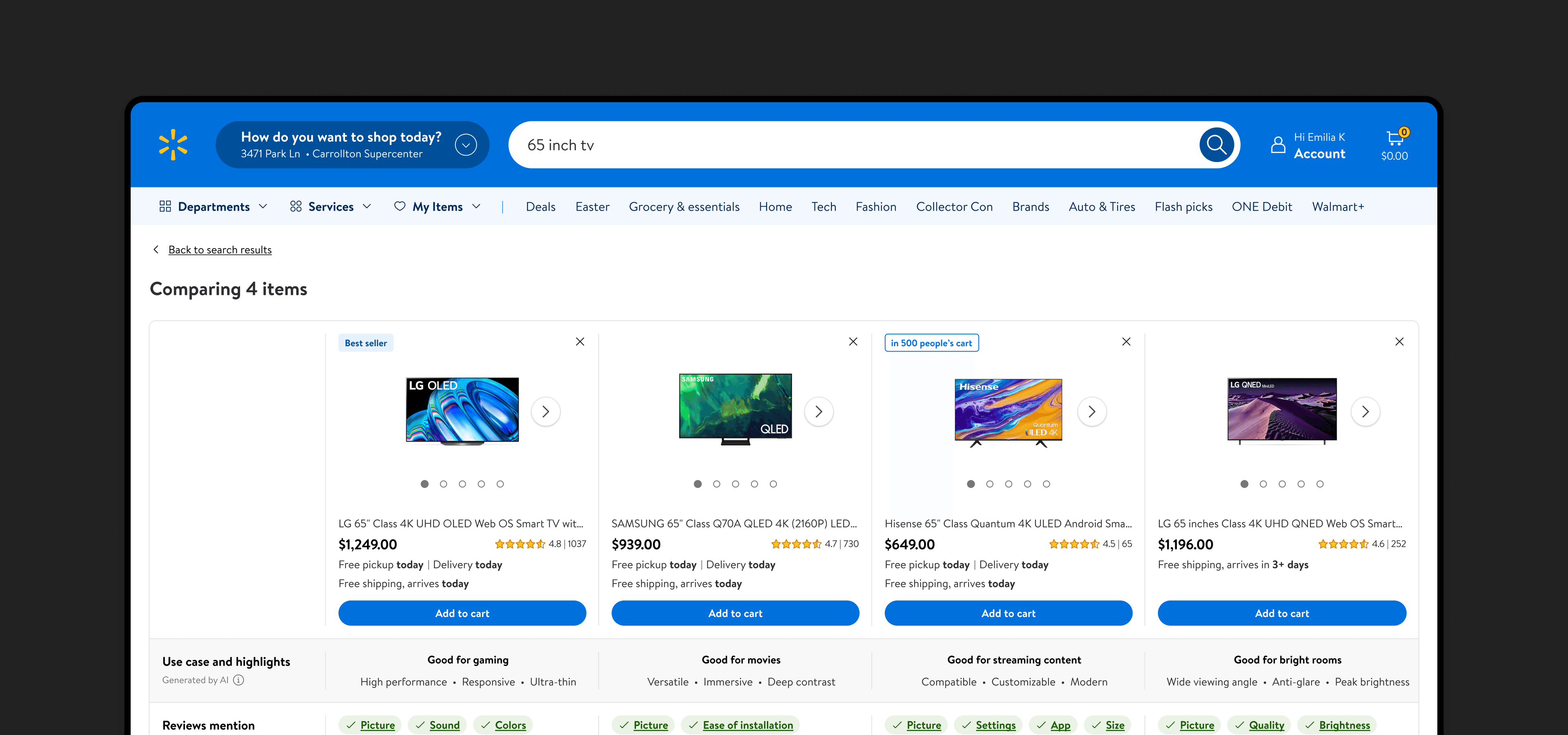
We know that comparing items on Walmart is difficult, especially products with complex specifications. By curating summarized item information side-by-side, we boosted buyer confidence, saved customer time, and increased conversions.
+0.00%
Add to carts per visitor, indicating reduced friction in shopping decision
+0.00%
First-time buyer conversion, indicating easy learning curve
-0.00%
Session cart removal, indicating higher quality of add to carts
+0.00%
of customers re-engaging the tool, indicating high value prop
Role
Designer
Domain
Search, GenAI
Date
Q4 2023
Responsibilities
Discovery, Journey Mapping, Strategy, Research, Testing, UX, Execution
Discovery
Walmart customers find it difficult to compare products and make a decision online, especially for high-consideration items (priced at $100 or above).
Along with benchmarking studies and voice of the customer feedback, we've seen comparing details between products being a huge pain point for customers.

We are lagging behind many competitors, who offer an easier way for their customers to compare items across many different categories.

REI

Best Buy

Staples
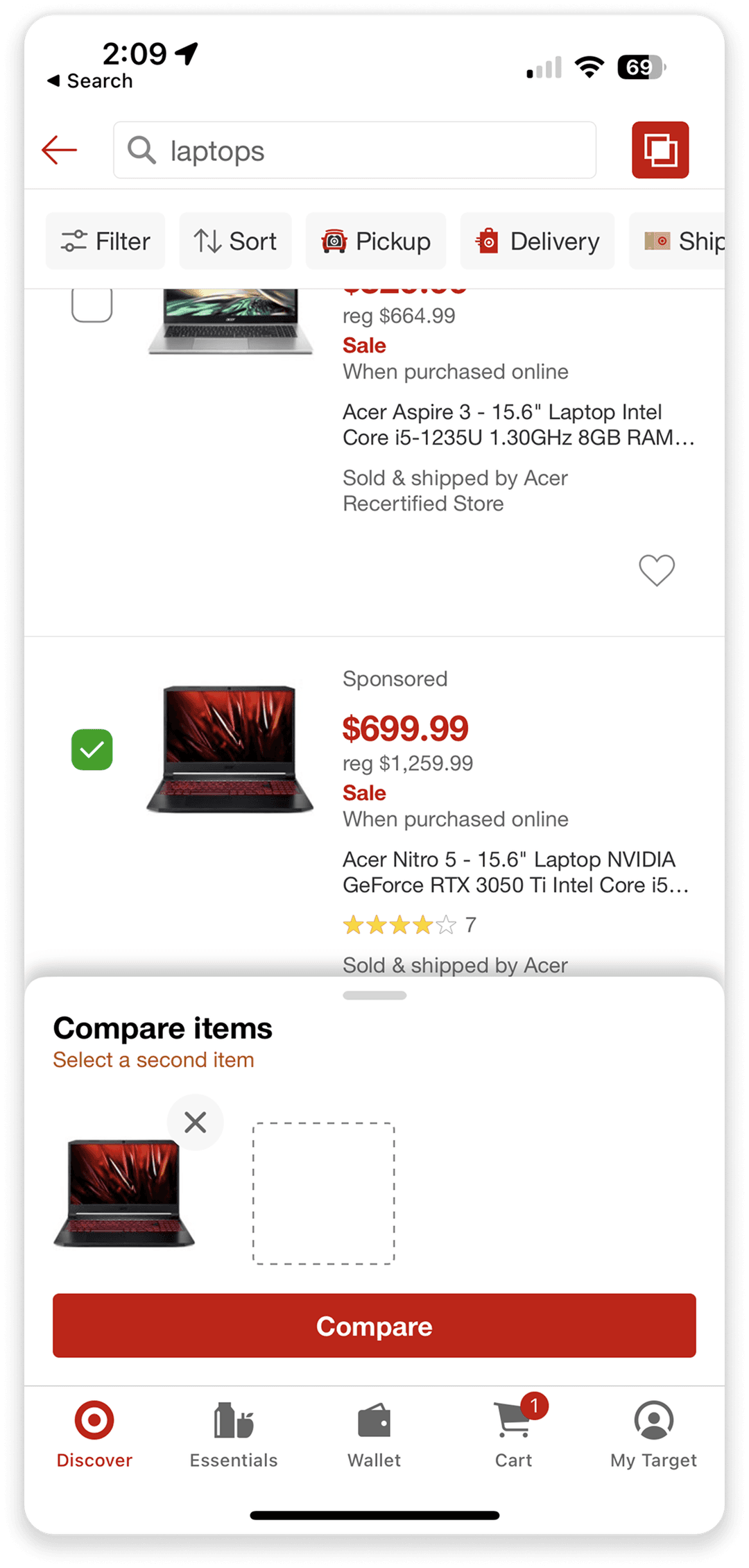
Target
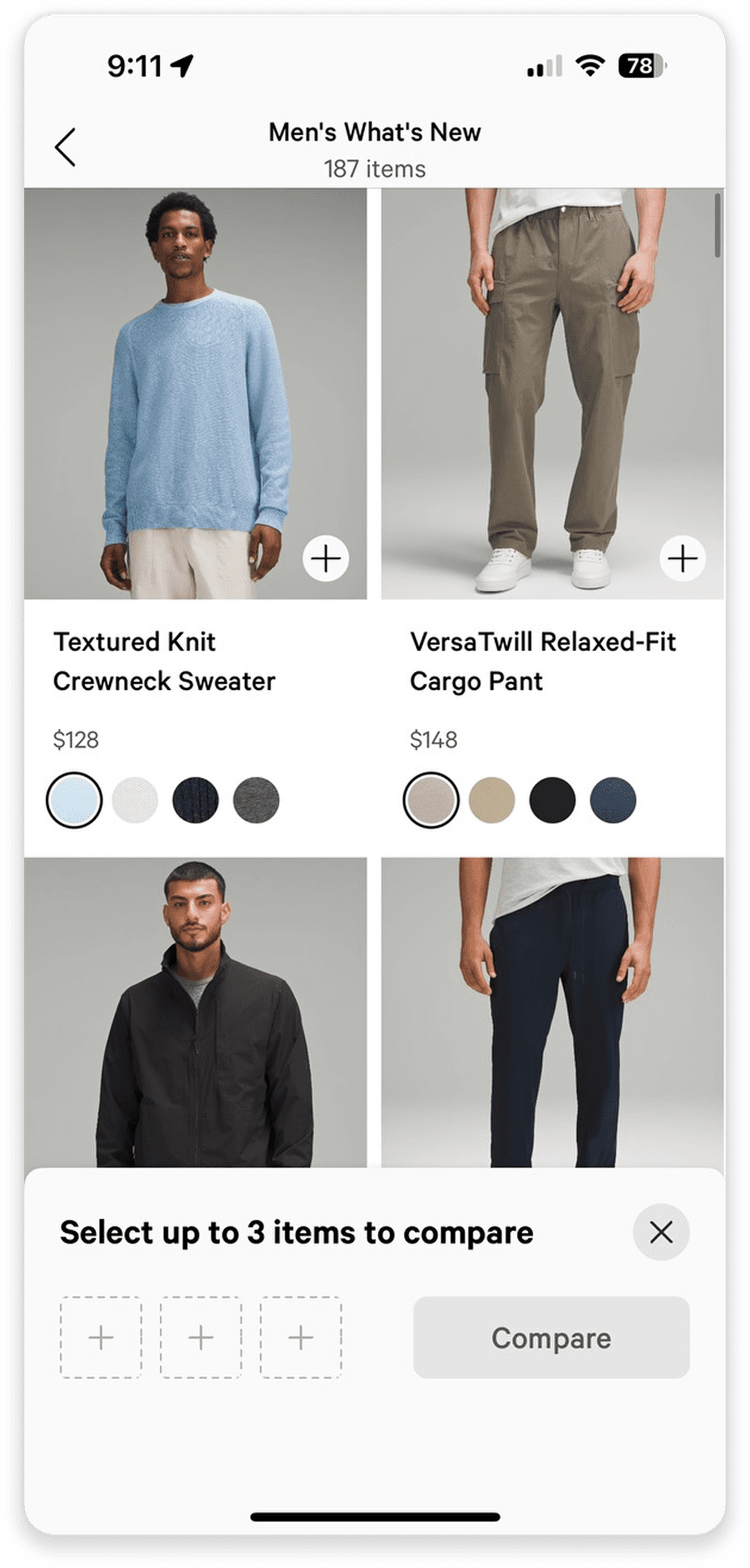
lululemon
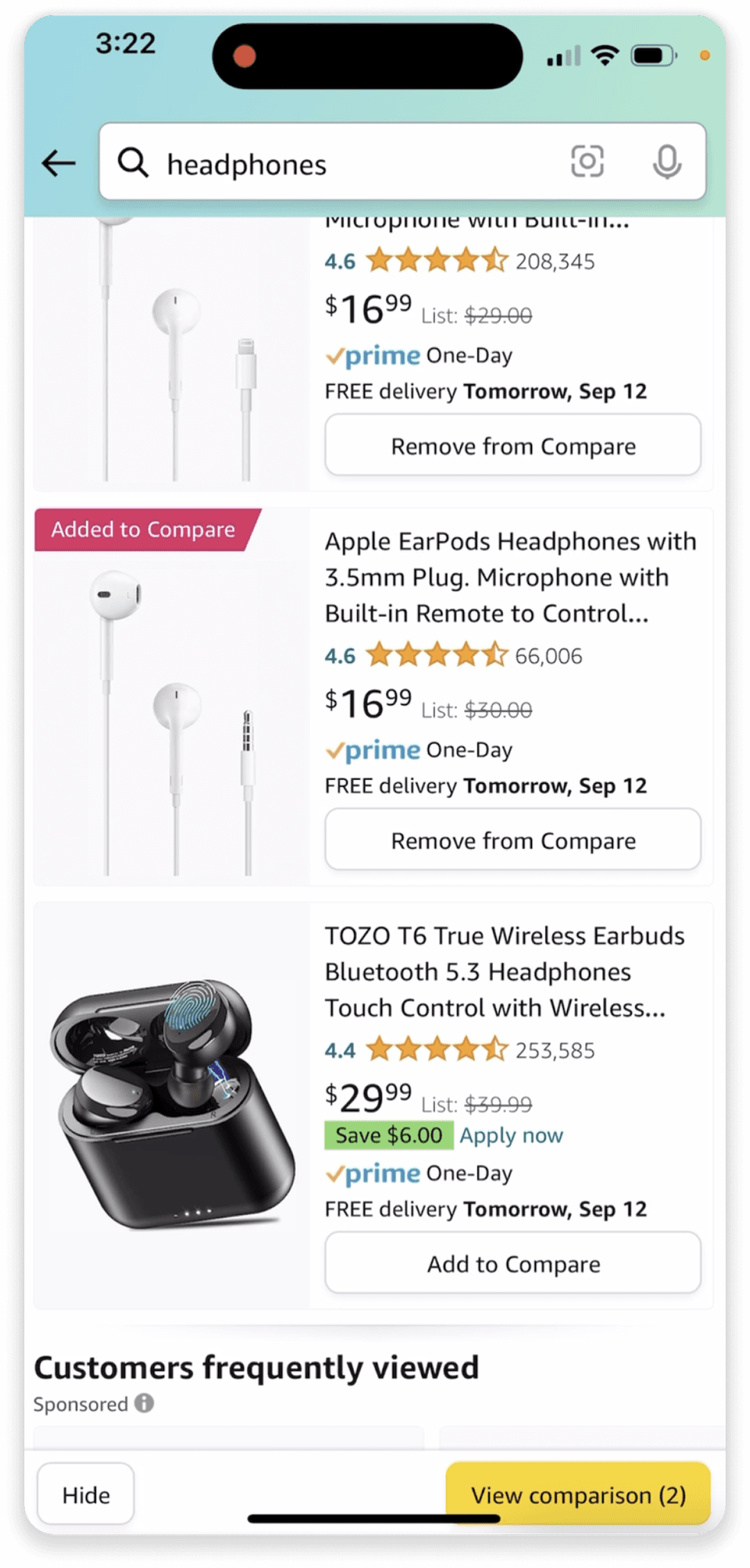
Amazon

flipkart
Strategy
Make the tool easily discoverable so customers can start to engage and develop a habit
Reduce cognitive overload by keeping the comparison interface clean and uncluttered
Use natural, easy to understand language when explaining technical and complex specifications to customers
The tool should not favor any product/brand/supplier and be transparent about its methodology and how it generates results
Leadership wanted to further invest in large language models to improve and simplify the end-to-end digital shopping experience for customers.
Design
Knowing that a chart is industry standard, we wanted to innovate beyond this concept

Although comprehensive, this design seemed too dense and resembled our item pages too closely

Data quality issues prevent us from leaning into asking for customer preferences

Leadership loved the idea of summarizing crucial details for customers in one single viewport
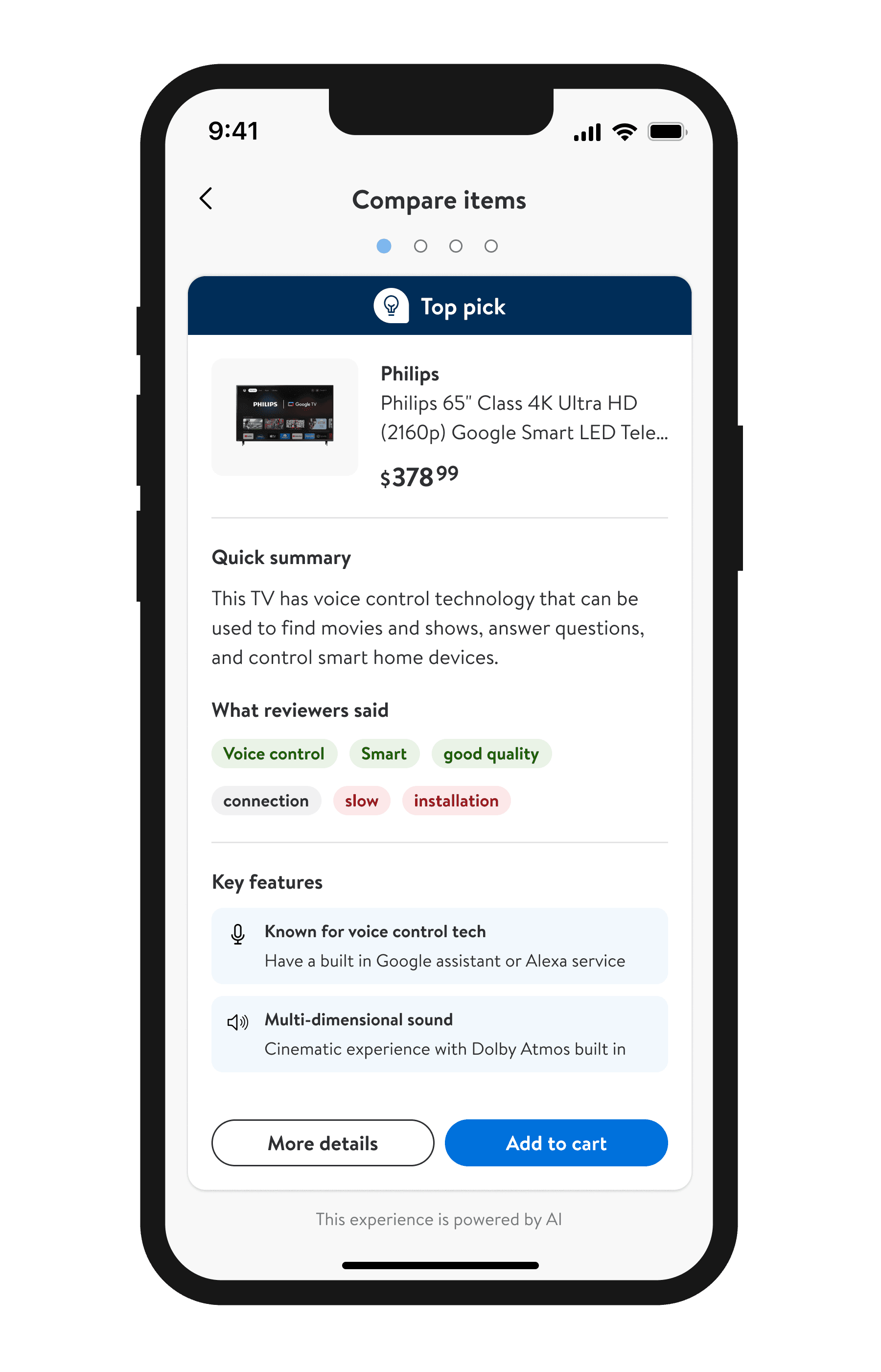
By providing recommendations with curated information, we will increase buyer confidence and reduce back and forth between search and item pages.
Research
My contributions: While consulting with my Design Researcher, Jen Luong, I conducted a DIY study which included drafting a study plan, conduct unmoderated study of the prototype, synthesis of results, and creating the insights/recommendation deck.
Design
Responsibilities: Character limits, spacing, interaction, flow, error states, variants, AI-disclaimer with legal


Results
+0.00%
Add to carts per visitor, indicating reduced friction in shopping decision
+0.00%
First-time buyer conversion, indicating easy learning curve
-0.00%
Session cart removal, indicating higher quality of add to carts
+0.00%
of customers re-engaging the tool, indicating high value prop
Next steps

